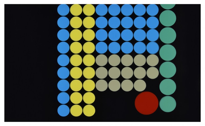
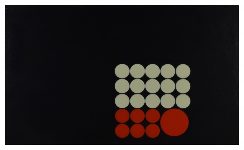
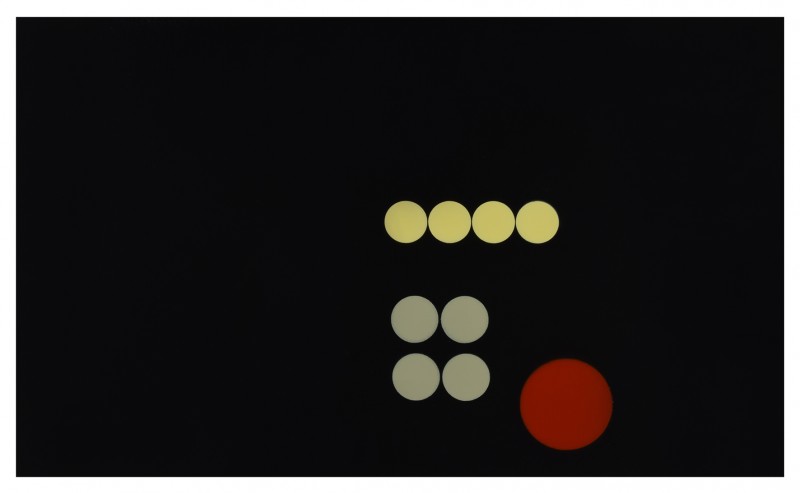
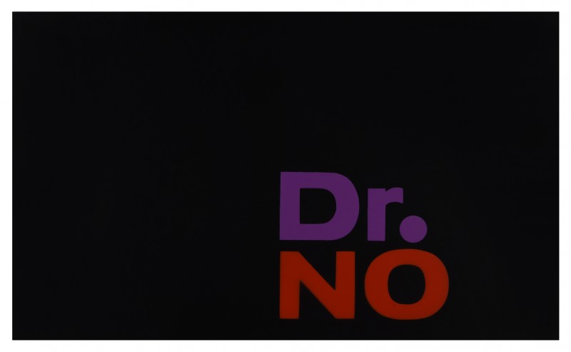
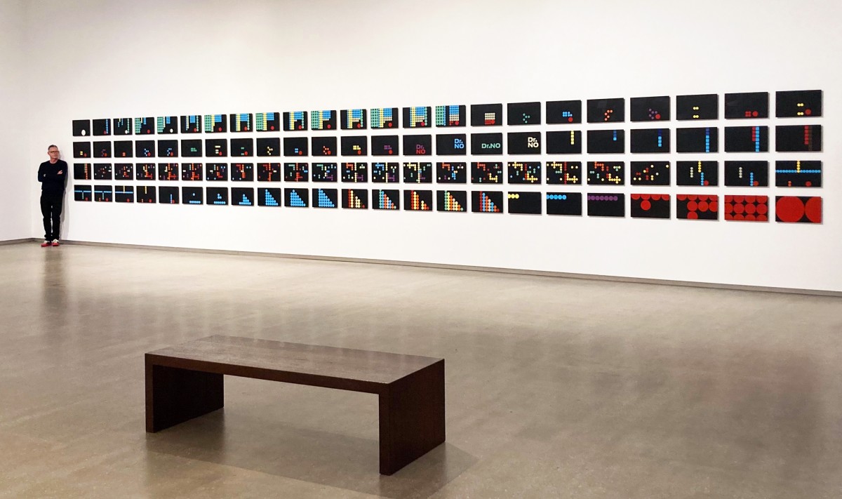
work / DR NO (after Maurice Binder) 2020 - 2023
SUPERsystems
Tarrawarra Museum of Art
23 March - 14 July 2024
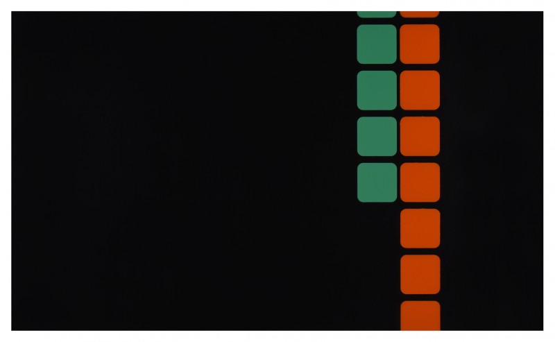
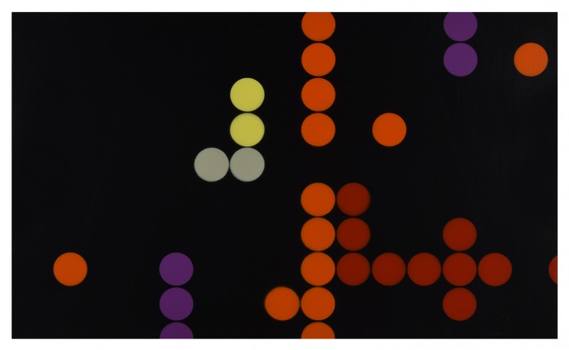
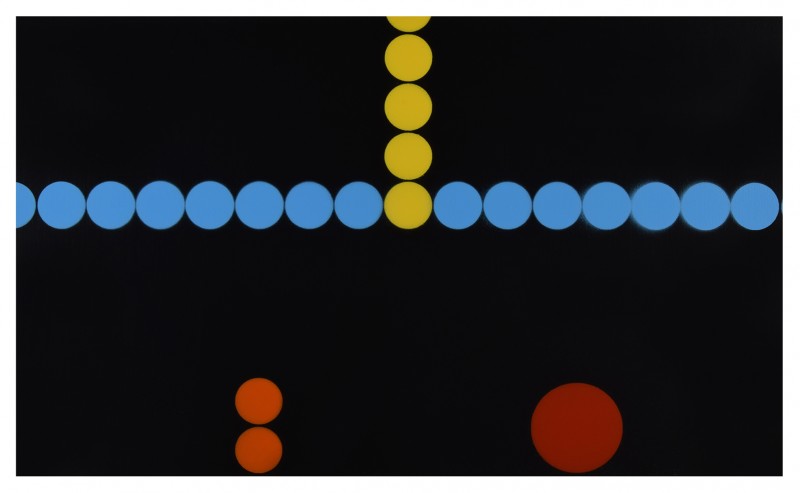
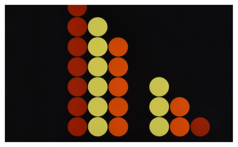
Dr No (after Maurice Binder)
Acrylic on 92 panels
46cm x 28cm each
2020 - 2023
LINK to Catalogue for SUPERsystems

Peter Atkins and Dana Harris: SUPERsystems
It is the differences that we notice first.
One work comprises a series of small, painted and stencilled wooden panels, while the other consists of a sequence of intricate embroideries. The smooth surface of the panels, with their combinations of bright colours on a black ground, contrasts with the tactile qualities of the textiles, which utilise a limited palette of vibrant pinks and purples. While the stencilled panels adopt a familiar language of simple geometric forms and text, the embroideries are abstract patterned fields made up of rhythmic sequential stitches.
Yet the two works in SUPERsystems — Dr. No (after Maurice Binder), 2020–23, by Peter Atkins and fancywork, 2020–23, by Dana Harris — also share many characteristics. Atkins and Harris, Melbourne-based artists who live together and work in adjacent studios, each initiated their projects during the COVID-19 pandemic and both of their works are the result of engaging in activities that were very particular to that time. Both projects also respond to familiar aspects of the artists’ cultural milieu and immediate surrounds. Atkins’s inspiration, for example, came from the world of twentieth-century film and modernist design, whereas Harris found hers in the built environment of the city of Melbourne. Both works are also series-based, each comprising multiple and varied iterations of a similar form. And, as the exhibition title suggests, they also both follow an overarching system in which specific parameters of the work — scale, material, format, and so on — have been determined at the outset and then rigorously followed during the work’s creation.
Produced over three years, Atkins’s and Harris’s projects began when Melbourne residents endured the longest lockdown of any city in the world. For 262 days, between March 2020 and October 2021, our movements were restricted and interactions with those beyond our immediate household were limited. While usual freedoms were removed during lockdown, for many, one of the upsides of the experience was having more time. We baked, we read, we walked (within the approved five-kilometre radius) and we looked at our phone, computer and television screens even more than usual. Atkins recalls how the digital screen became a critical tool: as a form of entertainment, as a means of communication and as a medium for engaging with the world beyond his house and studio. In the early stages of the pandemic, he began a James Bond festival, rewatching the entire action- packed back catalogue of the suave superspy’s films.
The first of the Bond movies, Dr. No, released in 1962, caught Atkins’s attention with its pulsating animated opening sequence. For an artist who describes his practice as ‘readymade abstraction’ (given his sources are found in the everyday), it was perfect material. Appropriating familiar designs — including advertisements, road signs, train tickets and record covers — Atkins removes extraneous detail to create refined abstract compositions that carefully balance line, form and colour. Designed by Maurice Binder — who subsequently worked on another 15 Bond films — Dr. No’s animation sequence starts with a single white circle that emerges from a gun barrel. This creation of Binder’s has now become a signature sequence that signals the beginning of almost every subsequent Bond movie. In Dr. No, the white circle at the centre of the gun barrel then morphs into a series of differently coloured and scaled circles and round-edged squares that appear in changing configurations against a black background, sometimes incorporating the film title and the names of the cast and crew members. Using a computer program to separate each of the 270 individual frames that introduce the opening sequence, Atkins then simplified and pared back the graphic imagery, removing most of the text. Across 92 panels, Dr. No (after Maurice Binder) re-presents a new version of the animated design in which colour and geometric form create a monumental abstract design; its visual dynamism recalling its kinetic origins.
Another aspect of the self-imposed system that underpins this work is the action of taking something apart and then reconstructing it in a different way in order to more thoroughly understand both its constituent parts and its final form. This process-based concept emerged in part from Atkins’s and Harris’s deep knowledge of the work of Clement Meadmore, the acclaimed industrial designer and modernist sculptor, and particularly their shared inspiration in the principles of the Bauhaus and the De Stijl movement that both explored orderly and systematic production processes. Of particular significance is Meadmore’s 1975 book How to Make Furniture Without Tools which introduces ‘The System’, a method he developed which outlines the simple steps required to construct various well- designed pieces of furniture using nothing more than a standard sheet of plywood cut into various configurations and glue. Explaining the easy-to-follow DIY system, Meadmore writes: ‘The revolutionary technique described in this book makes it possible for someone with absolutely no previous experience and no tools to build handsome, sturdy wooden furniture’.1 In making their works, Atkins and Harris have followed Meadmore’s lead, developing unique systems which utilise a consistent range of materials to elaborate on a single theme or idea. The result, in both examples, is a richly nuanced expression of each artist’s material and conceptual preoccupations within which seriality, repetition and variation expand the creative possibilities, building a typology of visual language and form.
Unusually, in this instance, Atkins has incorporated the title of the film into four central panels of the work as a way of both acknowledging his source and as a generous identifying gesture for the viewer. The size of the panels replicates the size of the computer screen on which he viewed Dr. No and, while the stencilled coloured shapes have a smooth, flat finish, the brushstrokes which make up the black background are deliberately visible. With a nod to the distinctive abstract works
of French artist Pierre Soulages and his interest in the possibilities of black paint, Atkins’s gestural application results in a subtly textured surface which in turn creates reflections. For a work that starts with digital content and transforms it into an analogue format, this provides an interesting material and conceptual link, introducing light and movement into something that is otherwise solid and still.
Atkins sees abstraction everywhere and part of his creative project is to share this with his audience. Based on designs that, drawn from the everyday, are part of our collective visual and cultural consciousness, his unique brand of abstraction sidesteps the overt challenge that most viewers encounter when looking for meaning in pure abstraction. Atkins’s practice is deeply rooted in the history of modernism and the traditions of twentieth century art — from the radical simplicity of Minimalism to the post-modernist practices of appropriation and deconstruction. His focus on familiar elements of urban and suburban life, however, provides a way into the work which is different for each viewer; the memories and personal associations prompted by his source material invariably prompt a range of individual responses to, and interpretations of, his use of abstract forms.
Everyday life (such as it was during lockdown) equally inspired Dana Harris’ fancywork; particularly her daily walks around the city centre and through the grounds of the University of Melbourne. Although both of these areas were familiar to the artist, encountering them in their largely deserted state, enabled her to see them anew. Without the distracting activity of crowds, the experience of the city and university campus was transformed — it was ‘soft, clean, quiet and the light was beautiful’ — allowing previously unnoticed details of the urban environment to come into prominence.2 While some of the patterns in Harris’s embroideries respond to specific built forms and architectural ornamentation that the artist encountered, the work also expands upon her long-term interest in mapping. Indeed, Harris’s focus on the urban environment extends to the spaces that exist between sites and the varied paths one can travel to reach a particular destination. Her work can be understood as a translation of both factual information and less tangible forms of data, charting aspects of the intimate and personal through representation of individual experience and memory. In the context of the pandemic, this multi-part work can perhaps be read as an abstracted map that reflects elements of a familiar and frequently trodden path, as well as an expression of the complex psychological journey which the experience of lockdown, with its myriad challenges, imposed on many of us.
The gridded format and the scale of each panel were primary components of the fixed parameters Harris set herself as a system to develop fancywork. Measuring 90 columns wide and 23 rows high, the format of the panels contains an inherent tension between the adaptability of the number 90 — a round number, easily divisible in numerous ways — and what Harris describes as the ‘chaos’ of 23. Somewhat paradoxically, it is within this seemingly messy and irregular structure that Harris feels most at ease. Working instinctively without preparatory drawings and sketches, she constructs each embroidery with layers of differing stitches and colour variations. While she knows what the visual and aesthetic composition of certain stitches and combinations of stitches will yield, Harris also disrupts the flow of her designs by deliberately upturning elements of the system she has set in place. Through this push-pull process of control and release, an aesthetic challenge reveals itself, bringing with it creative risk and the potential for discovery. As Harris reveals, ‘this is what I turn up for in the studio every day.’3 Counteracting the free-form nature of her intuitive approach is the structured regularity of the grid of the embroidery matrix. Echoing both the layout of Melbourne’s city streets and the warp and weft of textile manufacture, this underlying grid surely contributes to the balanced, almost classical designs which emerge across the suite of embroidered panels.
Another key element that runs throughout fancywork is its striking colour palette, which is based on the fluorescent pink cord that builders and bricklayers use to create a string line. A braided synthetic material that is strong, without any give, this type of cord has a silky texture which reflects and refracts light, introducing an intensity and dynamism to each composition. Like Harris’s willingness to deviate from the routine regularity of ‘proper’ embroidery technique, this choice of unorthodox materials signals a conscious desire to move beyond tradition. As the slightly tongue-in-cheek title suggests, Harris is respectfully aware of the long history of decorative needlework, historically associated with highly-skilled women makers and the often unrecognised industry of the home. Her personal motivation as a contemporary artist is to use these craft techniques in unexpected and innovative ways, opening up new aesthetic and conceptual possibilities. The multi-panel format of fancywork enabled Harris to investigate the full extent of the medium’s expressive potential and the parameters set up around it, and within the austere beauty of each panel, remain continually surprised at the diversity and depth of the language it allowed.
The labour involved in the production of an embroidery is immense, and each of these panels comprises thousands of individual stitches. The starting point for Harris is always the thread and responding to its material qualities: the colour, the sheen, the texture. The relationship between the hand-crafted object and its maker is intimate. Here, the diminutive scale of the embroidered panels requires physical closeness, with each stitch reflecting a rhythmic movement of the hand as it guides the needle and thread. Simultaneously, the countless decisions about the position and character of every stitch yet to be made demands a parallel intellectual engagement and focus. Harris speaks of the ‘thinking’ and ‘doing’ of her art as being very closely connected and, in the process of making each of these embroidered designs, she identified individual personalities amongst all of them.4
Defined by the sequential elaboration of a visual idea with inherent physical and material parameters, Dr. No (after Maurice Binder) and fancywork echo the way that time passed during lockdown, as days unfolded slowly, only distinguished from the previous one by subtle shifts and variations. Reflecting the distinctive aesthetic sensibilities of Peter Atkins and Dana Harris, SUPERsystems shares with us meticulously realised artworks characterised by a restrained and elegant regularity — albeit with the inclusion of free-form gestural brushstrokes or rogue stitches which deliberately disrupt established or anticipated patterns. It is in these elements, where the idiosyncrasies of the hand and the working of the mind of the artist become clear, that the excitement of the creative act for both artist and viewer becomes tangible.
Kirsty Grant
Kirsty Grant is an independent curator and writer with a
focus on modern and contemporary Australian art and design. She was Director of Heide Museum of Modern Art, Melbourne, from 2015–16, and prior to that, Senior Curator of Australian Art at the National Gallery of Victoria.
1 Clement Meadmore, How to Make Furniture Without Tools (New York: Pantheon Books, 1975), p. 7.
2 Interview with the artist, 8 November 2023.
3 Ibid.
4 Ibid.
