interviews
Interview with artist Peter Atkins by Olivia Poloni 2021
First to begin, for people who may not be familiar with your practice, what type of work do you make and why?
I’m a project-based artist living in Melbourne, working across a range of disciplines including painting, sculpture, printmaking and collage/assemblage. My work is primarily interested in the readymade and centres around the appropriation and deconstruction of abstract forms/elements/fragments that exist in the urban environment. This material becomes the direct reference source for my work, providing tangible evidence to the viewer of my relationship and experience within the landscape. I’m particularly interested in the social and cultural associations these collected forms could evoke within the viewer, especially around personal narratives. I’m also interested in our collective, cultural recall - material that has the capacity to trigger memory, nostalgia or a shared history of past experience.
When I think about your practice the last sentence about collective and cultural recall particularly resonates with me. I love that your work generates a sense of nostalgia and shared history. With each new series I find myself able to make connections in my past that had been stored away in my memory and not accessed until that moment. We see this with your LXRP public art commission. Can you tell us about your work at Old Geelong Road?
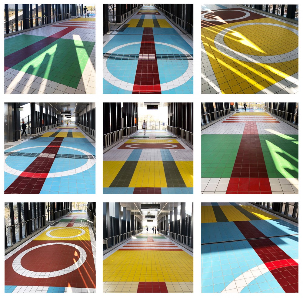
The work for the LXRP public art commission is titled TRACKwork and is based on the designs of obsolete suburban train tickets issued between 1920 and the late 1980s throughout Melbourne. There are six separate ‘tickets’ in total, each one is six meters wide by twelve meters long, stretching across the entire seventy-meter-long walkway of the overhead bridge - forming one continuous floor based artwork constructed in coloured, glazed tiles. The tickets represent a complicated and fascinating visual coded language that is particular to Melbourne. I’ve deconstructed the six tickets to their fundamental patterns, removing all text, numerals and incidental imagery. What is revealed is an extremely evocative collection of readymade forms that have the capacity to resonate with us all. I’ve concentrated on train tickets that have a particular context for people living in Hoppers Crossing and others further along the Werribee Line. All tickets included in this artwork (except one) are from the Western side of the city – Hoppers Crossing, Altona, Werribee, Corio and Ballarat. It was very important that the artwork was relevant to the site context so that the local audience could engage with the work. The odd one out in the series is based on the ticket issued for Puffing Billy and though it’s not from the city’s west it did seem appropriate to end the series with such a quintessentially Melbourne icon.
Can you further elaborate on the tickets?
I was conscious of the artwork relating to both the local audience of Hoppers Crossing and also, the broader community within Melbourne and Greater Victoria. I wanted to particularly focus on ideas around ‘movement’ and ‘locality’. As well as ideas mentioned before around history, nostalgia, location, mapping, social connections and memory. The train station at Hoppers Crossing could be seen as a connector, transporting locals away to other points in the city - to school, work or visiting family. Conversely, the station is also the place where visitors arrive into Hoppers Crossing from other stations within Melbourne and regional Victoria - to shop, attend work or visit family and friends. Train tickets are objects that have filtered through almost everyone’s life at some point. They could be seen as the great social connectors (as well as social levellers) between anyone of any age in Melbourne or regional Victoria who has ever used the rail network. I expect that when this artwork is experienced, by walking along its length, people will be provoked into a very personal response, perhaps triggering narratives or memories of journeys undertaken with family and friends between particular destinations - specifically around the western suburbs - perhaps to various sporting events in their region, VFL Park in Geelong, Racecourses at Warrnambool or Werribee or to Calder Raceway - or the daily trip to nearby stations to attend school or work. The tickets could also simply trigger memories of broader experiences, shopping in the city or weekends away visiting family and friends. These tickets are like connectors, connecting us all through time and place, to locations, events, friends and family in and around our beautiful city of Melbourne.
What medium are the tickets?
The artwork will be made using specially fabricated colour matched tiles, each one 20cm x 20cm. They are exclusively made by a company in Melbourne which was an important consideration for me. It was also a practical decision as the commission began at the very start of the pandemic in 2020 so it was important that materials were available locally. I was particularly drawn to tiles because they have been used extensively in metro/subway/underground stations throughout the world. Patterned tiling in these locations is ubiquitous and is often one of the first things you think of when remembering particular stations or cities. Tiling is a crucial part of the historical vernacular of train and subway stations. My proposal has been designed to focus on this aspect.
Can you tell me more about the artistic process and how you arrived at this particular solution?
It was a very long process with so many considerations because of the unique site context. For example, addressing potential graffiti was an issue, so the work needed to be easily cleaned and maintained. I needed to consider the safe accessibility of the artwork, especially for the vision impaired and as this is a bridge that spans across a number of railway lines any strobing or flashing coloured lights, i.e., yellow, red, orange would simply be unusable due to the safety aspect and possible confusion for train drivers. I visited the proposed site on three separate occasions and after considering the Architects brief, the design of the bridge and the open space surrounding the site I focused on what I consider the optimum location for my artwork – a floor piece stretching the length of the bridge walkway. This seemed the best solution as it addressed many of the above concerns and does not in any way compete with the design integrity of the bridge structure, which is almost like an artwork in itself – designed by architects Denton Corker Marshall. In many ways the artwork is complementary to the angled geometry of the bridge. Ultimately the work will be truly embedded into the fabric of the structure, relating to the site context. The experience for the user will be twofold. Firstly, when arriving at the site they will have an initial engagement or reaction to the bridge structure itself as well as the open space, as intended by the architects and landscape architects. After ascending to the walkway, either by stairs or lift, the user will then encounter the artwork itself, this is the second part of their user experience. An expanse of bold geometric forms in vibrant colours stretching the length of the walkway. It is only at this point, when the user reaches the upper walkway of the bridge, that the artwork is revealed. A hidden jewel waiting at the top of the stairs. Both experiences for the user are separate (seen and experienced separately) but still complimentary, as both are enmeshed together forming a unifying whole.
There are so many considerations when working on public art. Do you enjoy the process and working as part of a multidisciplinary team?
It’s very different to working in the studio where as an artist I have absolute control over everything I do. Working on large public art projects often require different skill sets including working in teams, being adaptable or flexible, especially over long periods (in this case two years), the capacity to understand specific site restrictions as well boundary constraints relating to materiality, and an understanding of the importance of scale. I have really enjoyed working on this project as it has pushed my practice into interesting new areas. The teams at Denton Corker Marshall, T Projects and LXRP have been a dream to work with. Everyone was so enthusiastic regarding the proposal and really embraced the concept. This has made the entire process not only enjoyable but run very smoothly because we are all on the same page. A lot of research and consideration went into creating the original TRACKwork proposal, which was fascinating in itself. I’m looking forward to seeing the finished artwork in 2022 as well as the public’s response to it.
What do you think the role of public art plays today?
Public art plays such an important role on so many diverse levels. Of course, each artwork operates completely differently, but generally, successful public art should elevate or possibly challenge collective and personal experience by encouraging people to engage with concepts and ideas outside of their day to day lives. In doing so, the experience of encountering a public artwork will hopefully stimulate or provoke interesting dialogues between the viewer and the artwork. I believe more public art opportunities should be encouraged throughout the city, especially with all the new construction happening, as these connections outside of our homes, post Covid, are becoming more and more important.
Below is an edited interview with Peter Atkins by the New Zealand - born artist Jake Walker in which the artist discusses key issues in his practice.
Jake Walker: Could I start by asking you when you first became interested abstract painting?
Peter Atkins: I first became interested in abstraction through the work of Ian Fairweather, Tony Tuckson, Grace Crowley and Ralph Balson when I was studying at the National Art School in Sydney. This led to an interest in Oceanic Art and textiles, Outsider Art, Folk Art and Quiltmaking, particularly early Amish quilts and the quilts from Gees Bend in the U.S.A. I’m particularly attracted to that imperfect homemade or handmade aesthetic. This is reflected in the type of material I choose as the support surface for my own paintings, often simple plywood, used tarpaulins or unprimed canvas. My work resides in a space between abstraction and representation and I have begun adding the title Readymade Abstraction to various projects as I believe this helps clarify it. I paint existing abstract forms that are collected or found in my immediate environment, as a kind of personal documentation of things seen and experienced. I am interested in the cultural associations of particular forms or groups of forms that can trigger memory, nostalgia or a shared history of past experiences. I see my practice as an amalgamation or mash-up of Modernism, Pop Art, Minimalism and Post Modernism.
JW: Could you please elaborate on how in practical terms these ideas/concerns have come together in previous bodies of work?
PA: The Susie Cooper paintings from 1995 were the first works that used found forms as direct reference material. Cooper designed the five cups in the late 1960's as a response to her visit to Carnaby Street in London. I found the first cup in a junk shop along the New England Highway in 1994. Over the next ten months I sourced the other four cups from the set. Two from Sydney and one each from London and New York. When I exhibited the series of five paintings at Tolarno Galleries in 1995 the corresponding cups were also exhibited in a small cabinet to the side. The cups provided tangible evidence to the viewer of my experience in the landscape; the research, the collecting, the documenting. A later series of work from 2001 titled 'Caravan Suite' highlights the progression of the practice from the Susie Cooper series. We had a few days over summer with our young son in a caravan park along the Great Ocean Road. I became aware of the abstract angular designs painted on the sides of the caravans. The more I looked the more engrossed I became. The forward angled stripes and forms suddenly revealed themselves as a complete formal design language. They seemed to suggest moving forward, traveling, perhaps to someplace better. In the end I must have photographed every caravan in that park. This series of work truly reflected the ideas that I mentioned earlier regarding trigger points for memory, nostalgia and our shared experiences through existing abstract forms. With this series I wanted to expand upon earlier works by attempting to locate the experience as an Australian one. It is this communal memory of a beachside experience that I wanted to evoke in 'Caravan Suite' .....long hot summer days, the smell of melting bitumen, sunburn, zinc cream and endless hours in the surf. Ultimately this is not just my personal experience but one shared with many. The idea of a shared narrative is a concept I have continued to explore and develop over the past decade with various projects including 'Disney Color Project', 'Melway Project' and recently the 'Hume Highway Project'.
JW: Could you tell me a little about the Hume Highway Project?
PA: I have had countless roadtrips along the Hume Highway in the decade since moving to Melbourne. I had begun photographing the highway signage about 5 years before making the Hume Highway Project. I am always collecting and collating various material in the studio and this was one of many possible projects I was “collocating” at the time. Sometimes it takes years of collecting to arrive at a point where a project is ready to commence. It wasn't until I stopped to photograph the orange and brown Seymour Wineries/Army Museum sign that it all came together. There was something about the two colours floating over each other that reminded me of the work of Rothko. In that moment I saw these objects not so much as signage but as enormous abstract forms. From over 500 documented images of highway signage I began the process of editing them down. First to 70 then 20 and finally arriving at what I considered 12 essential markers along the Hume Highway route between Melbourne and Sydney. I am particularly drawn to seemingly ordinary or common elements that surround us in our day to day existence. Things that many people may simply disregard. Highway signage is a perfect example. However when these things are taken out of context and re-presented back to the viewer they can challenge perceptions and hopefully reveal a new way of interpreting the world around them. When the work was exhibited it was amazing to see people engaging and interacting with the work, enjoying a real connection to what I had painted. It was as though I had presented the outline of a narrative that others felt included in and compelled to add to. Many people remarked on the Dog on the Tuckerbox and said things like 'I remember stopping there with my parents when I was a kid' or 'I love Gundagai...I always stop at the Niagara cafe when I pass through'. This was the reaction I was hoping for. It is this connection to place and communal ownership of specific experiences that I am interested in.
JW: Its interesting that you saw the signs as abstract form because I guess in the 50's the commercial world saw the works of abstract painters as potential signs. Designers of the time must have realised abstraction's access to the subconscious, by removing recognisable imagery they would have a more direct route to the emotions and then they could sell us more stuff. Your works nicely reclaim this imagery as painting and as you've said expand the individual motifs into a narrative whole yet still utilizes the strength of colour and design from the source material?
PA: It's interesting that you have used the word 'reclaim' because this is the word that best represents how I view my reference material. For example a few years ago I was working in Los Angeles and produced a series of twenty studies and later upon my return to Melbourne a series of five large paintings. This exhibition was titled 'Welcome to L.A/ Readymade Abstraction' and chronicled my experiences in L.A. through various collected forms. The very first work was titled 'Grubb and Ellis' , a large yellow and black circle divided diagonally by a thick white band. Grubb and Ellis was a real estate company and these signs were ubiquitous in L.A.. When I saw the first sign I immediately thought of the work of Sydney Ball. In particular his Canto series of paintings from the mid 1960's which used a similar pictorial device of bisecting circular forms diagonally with various coloured stripes. When I painted the study later in the studio I felt as though I was re-claiming this form back from the advertising/design world and re-instating it back to art. That’s not to say that the form wont be appropriated back again by someone else in a design field. That is the story of Modernism and Post Modernism and I find these shifts compelling. Similarly, in the medical section of the 99c store in Beverly Hills I found a small box marked 'medicated cream'. The box was white and brown with two white vertical angles bisected by a mid grey line. The colouring reminded me of the work of Eileen Gray, an Irish born architect/designer known for her muted earthy tones. Visually, I am continually linking forms back through the history of Modernism, just as I thought of Rothko when I looked at the highway signs. All things contain an inherent narrative just as everything is an amalgamation of what has gone before. What is interesting is that these narratives will bounce into the future as they continue to be adopted, adapted, deconstructed and re-contextualised.
JW: Your answer got me thinking about ownership and how there was a time when a painter could find a motif and claim it as their own eg: Joseph Albers’ squares or Barnett Newman's lines. It seems to me that your work is positioned within a contemporary context due to it conceptual framework but underneath that lies an equally pressing concern of the object, and of striving for perfection within each individual work.
PA: As my work has progressed over the past two decades the connection back to the found object has become paramount. Essentially all of my work is about me in the landscape, what I am looking at and what I find interesting. That is why I display the reference material in the gallery. The collected forms provides the context and the connection to my practice. As far back as 1990 when I made my first 'Journal' traveling through the USA, I was interested with the idea of conceptual boundaries. I developed a framework for these small works as I traveled and I encouraged myself to engage with the local environment on various levels depending on what was presented and observed. As a result each work was essentially different from the last. Some images were painted while others were assemblages of collected material, I even made collaborations with other artists and craftspeople along the way. It was my first attempt at an experiential recording of my actions, located specifically within time and place.
JW: The recent series of work is titled ‘Monopoly Project’. It is an interesting progression from the ‘Hume Highway Project’. Can you describe this continued exploration/documentation of a journey….albeit a conceptual journey around a game board?
PA: The idea of mapping or documenting personal experience within specific environments has been at the core of my practice for a long time. This can be seen in early ‘Journal’ works from the USA, Spain, Israel, India and South America etc. Of particular interest are those abstract forms that provide a platform for cultural recall or a shared connection to communal memory and nostalgia where we are all encouraged or invited to partake and claim ownership. ‘Monopoly Project’ is the perfect example of this collective association. Monopoly memories span across gender and age for most of us. Families play it at different times, at different locations and on different surfaces. My memories include frosty mornings, warm toast, squabbles with siblings, cousins who stopped at nothing (including cheating) just to acquire the most coveted properties ‘Mayfair’ and ‘Park Lane’. Sometimes it became a late afternoon past time when we were bored over the long summer holidays Often it was played well into the night. Ultimately it was always a communal event - a shared experience. This accumulation of memory and experience is not unique but shared amongst us all. The paintings in ‘Monopoly Project’ provide a platform, to share these countless narratives, and in doing so offer an opportunity for the viewer to enter in (through an an experience of abstact painting) and become part of the whole experience, to celebrate it and complete it in individual ways.
JW: The board game used for reference material in this exhibition is the one you owned and played as a child. How important is the relationship of the board to the exhibition itself?
PA: The board provides tangible evidence of my interaction in the world. It has become an historical artifact from my childhood and by displaying it I am providing a lineal narrative for the viewer from the past to the present. The board, cards and tokens show the marks of hundreds of games played over many years. This visible history is layered in personal narrative. Just by looking at it I can easily remember past incidents while playing as well as recall the feelings of cultural dislocation the strange English street names and train stations evoked, so completely foreign and far away for a 10 year old Australian country boy. I also remember my first visit to London in my early twenties and the overwhelming sense of familiarity with the city. I had a mind map of the city that had been etched in my memory. I would expect that this will also resonate with others when they see the paintings in the exhibition.
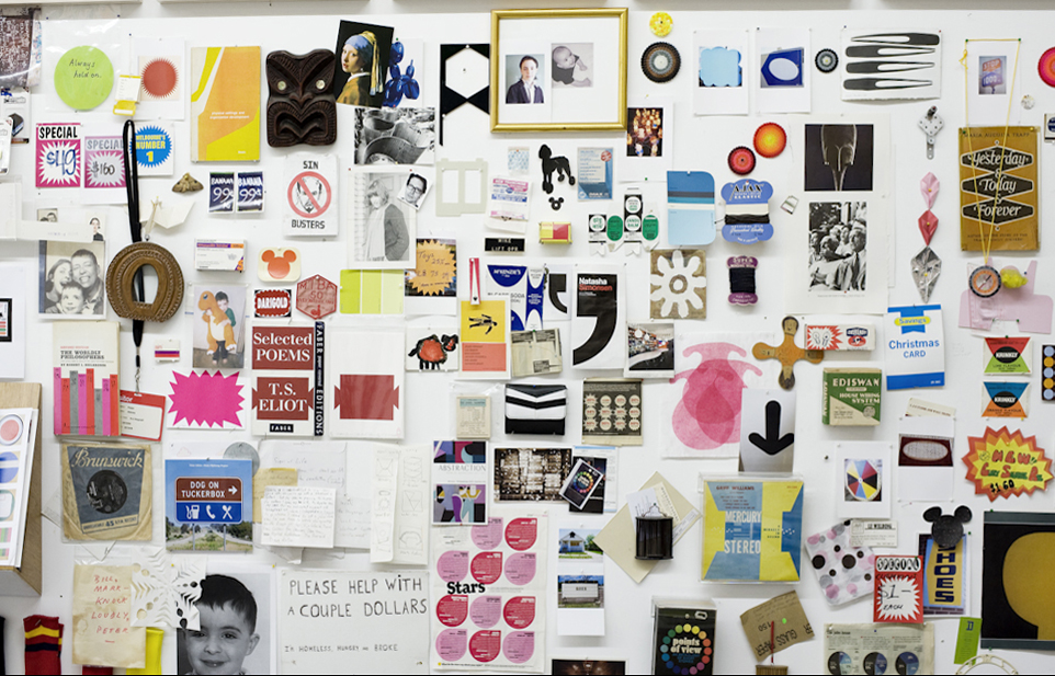
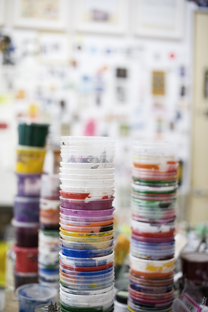
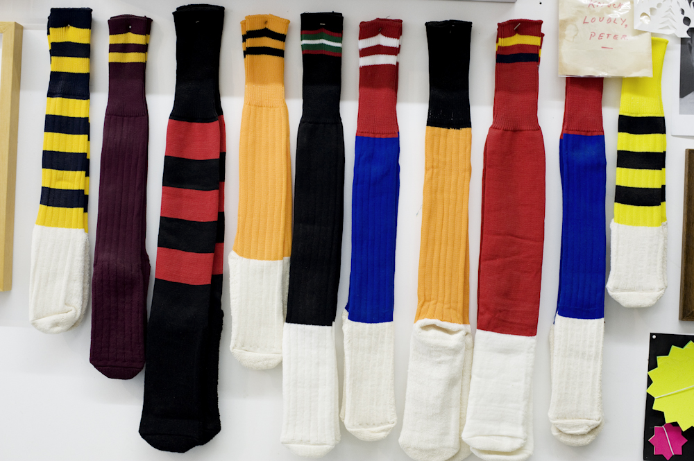
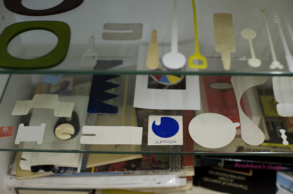
Below: Images of the artists studio 2012. All images courtesy of Jake Walker.
